Our Rebranding Effort

In 2021, we undertook a significant rebranding effort and we thought we would share something our motivations and journey to the brand you see today.
Why Now?
Covid-19 caused us to take some time for introspection and reconsider our mission and how our day to day operations is linked to this mission. We talk a lot about eliminating waste but this is a challenge to put a finger on. Eliminating waste was a mantra for Taiichi Ohno at Toyota and it guided how we built our factory. But a lot of our work involves product design and working with clients through the New Product Introduction (NPI) process. This is when crucial decisions are made that determine the impact the product will have on the environment. What is the product life? What is the end of life processing? We also created our own product since the last rebranding and having our logo on a physical product was a major change for us. What did we want this logo to represent? What do we stand for? What are we prepared to sacrifice?
How Did We Do It?
We worked with Olivia Wheeler at Acton Circle. She only works with purpose-driven organizations. We took the kernel of "eliminating waste" and honed it into a more specific vision: Eliminate e-waste from landfills globally by 2050. It's not enough to say "ties go to the environment". We have to commit ourselves to lead our industry to a better environment. We have to seek out the problems rather than wait for them to become catastrophes. We concluded that the root cause of e-waste is the production of electronics that are very nearly trash already. A product must be designed away from the landfill in order for it to avoid this fate. We came up with 10 ways that electronic devices could be improved and we are championing these ideals wherever we can, including the design of our own products.
Anatomy of the Brand
Our old font was Trebuchet, a sans-serif typeface commissioned by Microsoft. For our new logo, we opted for a serif typeface that was more humanist and conveyed the act of writing. It is called New Spirit and it is an update of the Windsor typeface. Windsor had an eclectic run as the typeface for Stewart Brand's Whole Earth Catalog among other things. New Spirit is a bit cleaner and the shape of the letters melded more nicely with our existing clover logo mark than any other. Dropping "devices" allowed us to enlarge the letters and going to one color saves resources when silkscreening. We do incorporate the word "devices" into our tagline which sometimes accompanies our corporate logo.

Throughout our website we also wanted to bring in a serif typeface inspired by brands like The Nature Conservancy, Wikipedia, and The Economist. Here we chose the Freight Text typeface, developed by Joshua Darden, the first known Black typeface designer. Born in Los Angeles, he published his first typeface when he was 15 years old. We purchased Freight at FontShop and use it for our titles and primary headings.
For our everyday workhorse typeface, we exchanged Roboto for Inter. Roboto is a little bit narrow, and it turns out that Inter was developed by a Swede living in San Francisco, Rasmus Andersson, as a solution to a bunch of limitations he found with Roboto. It looked good and it was widely available free of charge. Tack själv, Rasmus!
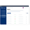
We updated our color pallet to bring us closer to nature. Our blue is unchanged but we made our accent color "leaf" green to symbolize organic growth. We will carry our red and green color pallet into our test reports so they will be easier for an international audience to recognize "pass vs fail" test results.


Our New Tagline
When we were a young design house, our tagline was "Dependable by Design" to convey our engineering thoroughness and attention to detail. Gradually more and more of our business was manufacturing for our clients, and we noticed that an ever-growing percentage of our output was IoT devices. So in 2014, we changed our tagline to "THE IoT ODM." We predict IoT is going to be more or less presumed of all devices so it's less of a point of differentiation. But "Blue Clover" by itself doesn't provide much of a clue about what we do, so we opted to put "devices" into the new tagline. Most important of all, was to capture our dedication to the environment. We believe that the devices we make and the way we make them can impact our planet, which led to our new tagline: "Better devices. Better planet."


Leave a comment